From Snowfall White to 24K Sunrise, QWEEN is expanding the traditional three-colour gold palette through alloy-led colour innovation
Gold has long carried a fixed visual language in India. Yellow, white and rose have traditionally defined the palette, while the metal itself has remained closely associated with heritage, milestones and permanence.
QWEEN is challenging that convention with the introduction of 7 Colours of Gold, an offering that expands the traditional palette to seven distinct gold colours and places greater emphasis on personal expression.
The brand describes the move as an attempt to make gold more individual—allowing consumers to choose a colour that reflects their mood, personality, wardrobe, skin tone or lifestyle.
The seven shades are Snowfall White, Cloudy Grey, Clover Green, Rose Bloom, Champagne Fizz, Desert Noon and 24K Sunrise.
When gold becomes a colour story
The proposition goes beyond simply adding coloured finishes to jewellery.
According to QWEEN, each of its seven colours is created through carefully developed gold alloy compositions, rather than relying on rhodium plating or other surface treatments to alter the appearance of the metal.
This distinction is central to the brand’s proposition: the colour is intended to come from the gold itself rather than from a coating applied over it.
The result is a broader visual vocabulary for gold jewellery, allowing consumers to explore colours beyond the conventional choices available in the Indian market.
From three colours to seven
QWEEN’s approach isn’t limited to choosing a different colour for an individual piece.
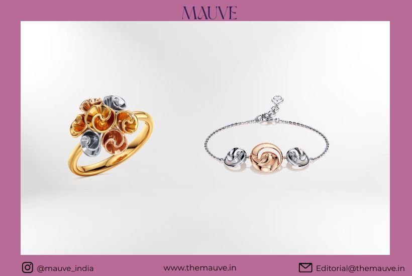
The brand is also bringing multiple colours of gold together within contemporary jewellery designs, creating combinations that move away from the idea that gold has to exist in one conventional shade.
The seven-colour proposition therefore becomes less about a single new jewellery trend and more about customisation and self-expression.
“Gold has always been deeply emotional in India. It marks our milestones, carries memories and often becomes part of the stories we hold on to,” said Amit Kumar, Co-Founder and CEO, QWEEN.
“At QWEEN, we believe something this personal should also leave room for self-discovery and self-expression. A woman is never just one version of herself; she has 20,000 shades.”
For the brand, the idea is to give consumers more ways to express those different sides by reconsidering not only how gold is worn, but what gold itself can look like.
Making jewellery more experiential
The seven-colour launch also fits into QWEEN’s wider approach to jewellery retail.
Positioned as a self-discovery and experiential luxury jewellery brand, QWEEN aims to make the process of exploring jewellery more open and less intimidating.
The brand’s retail environment uses open displays, while its offering includes natural gemstones and diamonds across 16+ collections and 3,000+ SKUs.
The seven colours add another layer to that discovery-led approach, allowing shoppers to experience gold through colour rather than approaching it only through traditional categories.
Consumers can currently explore the collection at QWEEN’s store at Aditya Ancora, Sector 50, Noida.
A billboard that turns gold into a spectacle
To introduce the new palette, QWEEN has also created an interactive billboard featuring seven signature Apostrophe design rings, each represented in one of the seven colours.
The campaign carries the line:
“Old is Gold. But Gold isn’t Old anymore.”
The billboard’s lights illuminate each ring one at a time, eventually revealing the complete seven-colour palette.
It is a fitting visual expression of the brand’s larger proposition: gold can retain its emotional and cultural significance while taking on a more contemporary visual identity.
The new language of gold
For generations, gold jewellery in India has been closely tied to tradition, occasion and investment. Contemporary luxury, however, is increasingly being defined by individuality—and jewellery is becoming part of that conversation.
QWEEN’s seven-colour proposition enters this space by asking consumers to look at gold differently.
Not simply as yellow, white or rose.
But as Snowfall White, Cloudy Grey, Clover Green, Rose Bloom, Champagne Fizz, Desert Noon and 24K Sunrise—seven interpretations of a metal that has traditionally been treated as timeless precisely because its visual identity rarely changes.
QWEEN’s proposition is that perhaps timelessness doesn’t require gold to remain visually unchanged.
It can evolve—and still remain gold.